- Tesco Resources
- Blog | Why planogram data is the missing piece of the puzzle for CPG Insights & Analytics teams
Blog.
Why planogram data is the missing piece of the puzzle for CPG Insights & Analytics teams
The past 12 months for consumer-packaged goods (CPG) brands have been undeniably challenging with the decline in consumer spending power clashing head-on with rising raw material prices. But now, with costs becoming more manageable and inflation rates slowing, the outlook for CPGs is showing some green shoots.
Against this backdrop, the role of Insights & Analytics teams within CPGs has become increasingly important. Tasked with helping the business understand changing shopper preferences and expectations, they provide the vital intelligence that brands need to respond confidently and quickly to emerging trends and new opportunities.
To do that effectively, Insights & Analytics teams need access to data from a wide variety of sources. Primary research, qualitative and quantitative analysis of the market and consumer behaviours, is frequently called upon, as is sales (or transactional) data. One data source that is used much less often, though, is planogram data – something that provides insight into the layout and arrangement of a CPG’s products within a retailer’s stores.
Used well, planogram data can add another dimension to a brand’s understanding of the market. If one category has seen extraordinary sales growth, for instance, the first question that a CPG might ask is whether that’s the result of increased shopper need or direct intervention by the retailer. If the category has been given more space, or moved to a more prominent position, for instance, then shoppers might be driving growth, but only as a result of actions taken by a retailer, something CPGs will only see in that retailer, rather than a wider economic trend.
So, why isn’t planogram data used by Insights & Analytics teams more often? Why isn’t it yet seen as one of the default resources for those teams to draw upon?

Billions of datapoints, limitless complexity
One of the main issues here is that of complexity. By their nature, planogram datasets are incredibly intricate; even a planogram for a smaller store can include layout information on thousands of individual products. When you multiply that across the entirety of a retailer’s store estate, and incorporate different formats into the mix, you end up with what is typically a gigantic and hard-to-manage dataset – one that can easily be billions of rows long.
That dataset isn’t static, either. Whether it’s seasonal updates, range reviews/assortment changes, delists, or any other factor at work, planograms are always changing. Weekly updates are commonplace, meaning that not only is there a lot of data to deal with, but there’s also always something new to learn from it too.
This isn’t simply a “human” problem, either. Until recently, it wasn’t even possible to structure this amount of data effectively; with so much information in play, the amount of processing power required to sort it into a useful model was beyond most organisations. Only with significant advances in technology have we seen data engineering hit the level at which planogram data can be converted into something truly useful.
It's those technological gains that underpin Planogram Publisher, an easy-to-use application that provides brands with actionable insights into how their products are being displayed in-store.
A vital addition to the Insights & Analytics toolkit
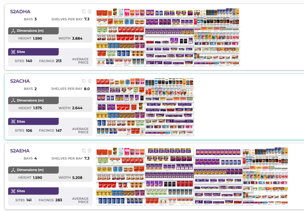
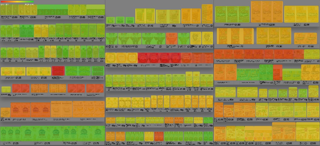
For Insights & Analytics teams, one of Planogram Publisher’s primary benefits is to solve that problem of complexity outlined above. Providing instant access to planogram data across a retailer’s store estate, Planogram Publisher generates engaging visualisations of shelf layouts that make it easy to understand exactly what customers see when they walk into a store.

Even in isolation, that capability provides Insights & Analytics teams with an easier way to keep up with layout changes and their potential impact on sales performance. In addition to those visualisations, however, Planogram Publisher also pulls a retailer’s planogram data directly into a CPG’s data lake including marrying up with other reporting mechanisms and datasets from other place planning software including JDA and Nielson Spaceman.
In turn, that enables Insights & Analytics teams to use planogram data in tandem with other sources of information. Say they want to know when sales have spiked despite their space at the shelf remaining the same. Perhaps they want to understand why a range review hasn’t led to the decline in volumes they might have expected. Planogram Publisher makes that possible, and without the extra effort that answering those questions would normally entail.
With Planogram Publisher, Insights & Analytics teams can:
- Combine planogram and sales data, creating actionable insights that help them see the entire performance picture – not just snippets in isolation.
- Turn a complex stream of planogram data into a simple and easily interpreted source of intelligence.
- Get to the heart of key trends, week-by-week, year-by-year, or on whatever basis is required.
- Uncover the “why” behind the “what” of sales performance.
- See the shelf as shoppers do, enabling them to make smarter and better-informed decisions around packaging and new product development.
More than anything else, Planogram Publisher provides a vital new source of information – one that Insights & Analytics teams can use to supplement traditional datasets and supercharge their understanding of the market.
Nick Theodore is the CEO of VST, the creators of Planogram Publisher.
Planogram Publisher is available exclusively on the Tesco Media and Insight Platform.